Hello fellow Gimpers! If your like me, you like to add a little "flare" to your pictures. What a better way to add flair, then with fire! This quick tutorial will show you how to make stand alone fire, along with fire on text. So lets get started!
First thing open up GIMP. For tutorial purposes, we will be working on one layer with no other images or text.

Once you have that, take the bucket tool and fill in the background with black. Then select the brush tool and make it white. I suggest using a medium size brush, but you can always experiment later.

Now, create a white line at the near bottom of the canvas. After that draw another line just above the one you just drew. Two or three lines are good, this will determine the "thickness" of your fire.
Something like this will suffice:

Now come the flames. Select the smudge tool.

Once the Smudge Tool is selected, start at the middle line (or top if you only did two), and click and stroke upward, creating a sort of flame effect. Do this all across your lines, top to bottom. The more lines, the thicker the flame looks. Once you have the first two (or one) lines smudged upward, work on the line right underneath. At the edges, kind-of smudge outward for a better look.


Great! Now you have your fire. "Oh, but Phoenix, the coloring is dreadful!" Dreadful? Oh, silly! Were not done yet!
Go to Colors > ColorBalance, and a window like this should come up. (Note: Make sure, if your dealing with multiple layers, the layer with the flames are selected. Also, you can get to Colors > ColorBralance trough both right clicking your image, or using the menu strip up top.)

Now, in this window, move the sliders to adjust the color of the fire.
Normally, this set up works real nice for a good flame color:
Shadows
Red = 100
Green = 30
Blue = -30
Midtones
Red = 100
Green = 30
Blue = -30
Highlights
Red = 100
Green = 0
Blue = -100
Make sure you have "preview" and "Preserve Luminosity" checked (located right under the sliders, above the help button), or else you won't be-able to see your image/ your image will not turn out like mines.
When you done, it should look something like this:

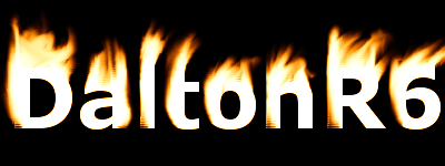
And there you have it! If you'd like to do the same with text, just smudge it, and color it. Using more advanced photo edditing skills, you can make fire just about anywhere. Just remember with text, white text on a black background should work the best.
Hoped you enjoyed this tutorial, and learned something from it. Written by Phoenix 7/21/2009 CC
First thing open up GIMP. For tutorial purposes, we will be working on one layer with no other images or text.
Once you have that, take the bucket tool and fill in the background with black. Then select the brush tool and make it white. I suggest using a medium size brush, but you can always experiment later.
Now, create a white line at the near bottom of the canvas. After that draw another line just above the one you just drew. Two or three lines are good, this will determine the "thickness" of your fire.
Something like this will suffice:
Now come the flames. Select the smudge tool.
Once the Smudge Tool is selected, start at the middle line (or top if you only did two), and click and stroke upward, creating a sort of flame effect. Do this all across your lines, top to bottom. The more lines, the thicker the flame looks. Once you have the first two (or one) lines smudged upward, work on the line right underneath. At the edges, kind-of smudge outward for a better look.
Great! Now you have your fire. "Oh, but Phoenix, the coloring is dreadful!" Dreadful? Oh, silly! Were not done yet!
Go to Colors > ColorBalance, and a window like this should come up. (Note: Make sure, if your dealing with multiple layers, the layer with the flames are selected. Also, you can get to Colors > ColorBralance trough both right clicking your image, or using the menu strip up top.)
Now, in this window, move the sliders to adjust the color of the fire.
Normally, this set up works real nice for a good flame color:
Shadows
Red = 100
Green = 30
Blue = -30
Midtones
Red = 100
Green = 30
Blue = -30
Highlights
Red = 100
Green = 0
Blue = -100
Make sure you have "preview" and "Preserve Luminosity" checked (located right under the sliders, above the help button), or else you won't be-able to see your image/ your image will not turn out like mines.
When you done, it should look something like this:
And there you have it! If you'd like to do the same with text, just smudge it, and color it. Using more advanced photo edditing skills, you can make fire just about anywhere. Just remember with text, white text on a black background should work the best.
Hoped you enjoyed this tutorial, and learned something from it. Written by Phoenix 7/21/2009 CC
Last edited by Phoenix on Tue Jul 21, 2009 5:36 pm; edited 1 time in total